Recently there have been several posts on the interwebs supposedly demonstrating spurious correlations between different things. A typical image looks like this:
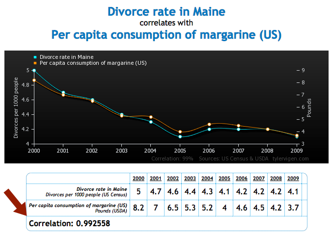
taken from here.
The problem I have with images like this is not the message that one needs to be careful when using statistics (which is true), or that lots of seemingly unrelated things are somewhat correlated with each other (also true). It’s that including the correlation coefficient on the plot is misleading and disingenuous, intentionally or not.
When we calculate statistics that summarize values of a variable (like the mean or standard deviation) or the relationship between two variables (correlation), we’re using a sample of the data to draw conclusions about the population. In the case of time series, we’re using data from a short interval of time to infer what would happen if the time series went on forever. To be able to do this, your sample must be a good representative of the population, otherwise your sample statistic will not be a good approximation of the population statistic. For example, if you wanted to know the average height of people in Michigan, but you only collected data from people 10 and younger, the average height of your sample would not be a good estimate of the height of the overall population. This seems painfully obvious. But this is exactly analogous to what the author of the image above is doing by including the correlation coefficient . The absurdity of doing this is a little less transparent when we’re dealing with time series (values collected over time). This post is an attempt to explain the reasoning using plots rather than math, in the hopes of reaching the widest audience.
Correlation between two variables
Say we have two variables, and , and we want to know if they’re related. The first thing we might try is plotting one against the other:
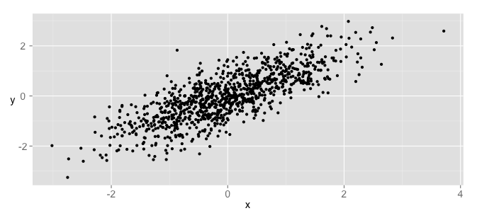
They look correlated! Computing the correlation coefficient value gives a moderately high value of 0.78. So far so good. Now imagine we collected the values of each of and over time, or wrote the values in a table and numbered each row. If we wanted to, we could tag each value with the order in which it was collected. I’ll call this label “time”, not because the data is really a time series, but just so it will be clear how different the situation is when the data does represent time series. Let’s look at the same scatter plot with the data color-coded by whether it was collected in the first 20%, second 20%, etc. This breaks the data into 5 categories:

The time a datapoint was collected, or the order in which it was collected, doesn’t really seem to tell us much about its value. We can also look at a histogram of each of the variables:
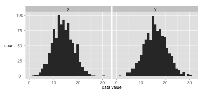
The height of each bar indicates the number of points in a particular bin of the histogram. If we separate out each bin column by the proportion of data in it from each time category, we get roughly the same number from each:
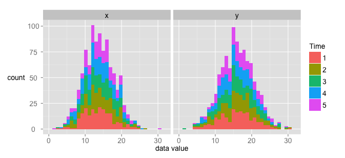
If plot the histograms of each 20% separately on the same axes, we get histograms that look pretty similar. Here are the histograms overlapped:
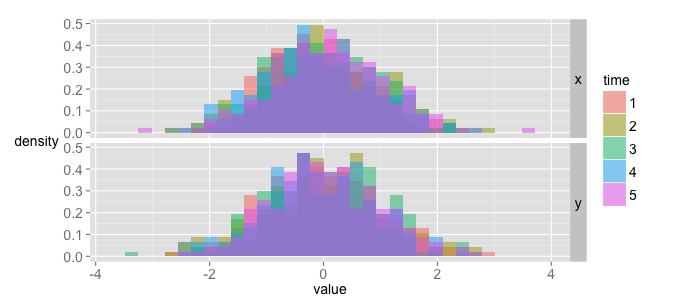
Alright, now let’s see what happens is we finally plot the data as time series.
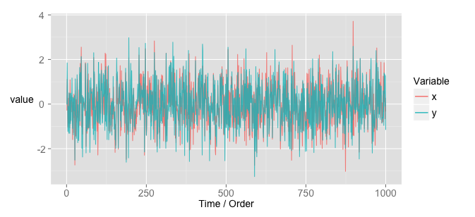
There might be some structure there, but it looks pretty messy. It should look messy, because the original data really had nothing to do with time. Notice that the data is centered around a given value and has a similar variance at any time point. If you take any 100-point chunk, you probably couldn’t tell me what time it came from. This, illustrated by the histograms above, means that the data is independent and identically distributed (i.i.d. or IID). That is, at any time point, the data looks like it’s coming from the same distribution. That’s why the histograms in the plot above almost exactly overlap. Here’s the takeaway: correlation is only meaningful when data is i.i.d.. [edit: it’s not inflated if the data is i.i.d. It means something, but doesn’t accurately reflect the relationship between the two variables.] I’ll explain why below, but keep that in mind for this next section.
Correlation between two time series
Now let’s look at an example of two time series that seem correlated. This is meant to be a direct parallel to the ‘suspicious correlation’ plots floating around the internet.
I generated some data randomly. and are both a ‘normal random walk’. That is, at each time point, a value is drawn from a normal distribution. For example, say we draw the value of 1.2. Then we use that as a starting point, and draw another value from a normal distribution, say 0.3. Then the starting point for the third value is now 1.5. If we do this several times, we end up with a time series in which each value is close-ish to the value that came before it. The important point here is that and were generated by random processes, completely independently from each other. I just generated a bunch of series until I found some that seemed correlated.
Here’s a plot showing the time series of and :
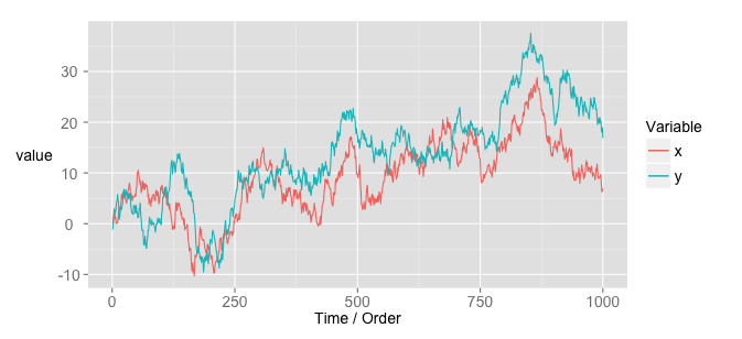
Hmm! Looks pretty correlated! Before we get carried away, we should really make sure that the correlation measure is even relevant for this data. To do that, make some of the plots we made above with our new data. With a scatter plot, the data still seems pretty strongly correlated:
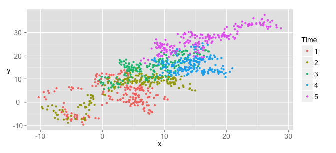
Notice something very different in this plot. Unlike the scatter plot of the data that was actually correlated, this data’s values are dependent on time. In other words, if you tell me the time a particular data point was collected, I can tell you approximately what its value is. That means that the data is not identically distributed (the time series lingo is that these time series are not “stationary”).
To make the point a little clearer, let’s make a histogram of the data.
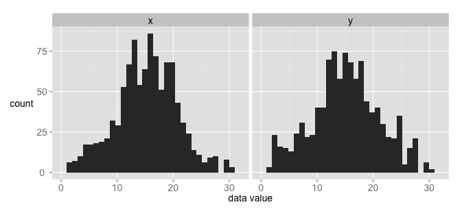
Looks pretty good. But now let’s again color each bin according to the proportion of data from a particular time interval.
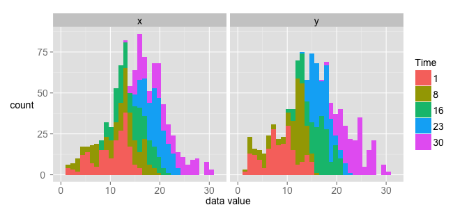
Each bin in this histogram does not have an equal proportion of data from each time interval. Plotting the histograms separately reinforces this observation:
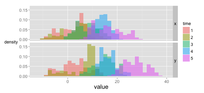
If you take data at different time points, the data is not identically distributed. This means the correlation coefficient is misleading, as it’s value is interpreted under the assumption that data is i.i.d.
Autocorrelation
We’ve talked about being identically distributed, but what about independent? Independence of data means that the value of a particular point does not depend on the values recorded before it. Looking at the histograms above, it’s clear that this is not the case for the randomly generated time series. If I tell you the value of at a given time is 30, for example, you can be pretty sure that the next value is going to be closer to 30 than 0.
One way to formalize this relationship is by looking at a time series’ autocorrelation. As the name suggests, it’s a way to measure how much a series is correlated with itself. This is done at different lags. For example, each point in a series can be plotted against each point two points behind it. For the first (actually correlated) dataset, this gives a plot like the following:
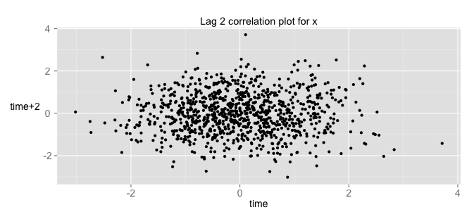
This means the data is not correlated with itself (that’s the “independent” part of i.i.d.). If we do the same thing with the time series data, we get:
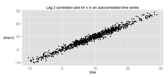
Wow! That’s pretty correlated! That means that the time associated with each datapoint tells us a lot about the value of that datapoint. In other words, the data points are not independent of each other.
If we plot the autocorrelation function at all lags from the first dataset, we get the following:
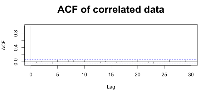
The value is 1 at lag=0, because each data is obviously correlated with itself. All the other values are pretty close to 0. If we look at the autocorrelation of the time series data, we get something very different:
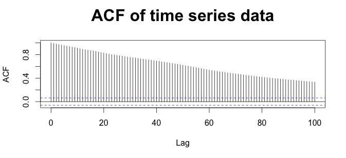
Again, the height of each bar tells how correlated each time point is, on average, with other points lag away.
But why does this matter? Because the value we use to measure correlation is interpretable only when the autocorrelation of each variable is 0 at all lags.
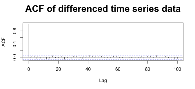
If we want to find the correlation between two time series, we can use some tricks to make the autocorrelation 0. If we do this, the will be interpretable as the correlation between the time series (explained in the next section). The easiest method is to just “difference” the data - that is, convert the time series into a new series, where each value is the difference between adjacent values in the nearby series. If we do this to our time series, the autocorrelation function becomes:
What happens if we plot the differenced data against time? We get:
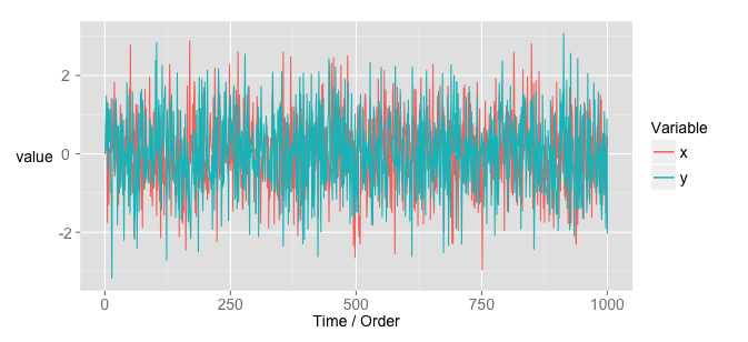
They don’t look correlated anymore! How disappointing. But the data was not correlated in the first place: each variable was generated independently of the other. They just looked correlated. That’s the problem. The apparent correlation was entirely a mirage. The two variables only looked correlated because they were actually autocorrelated in a similar way. That’s exactly what’s going on with the spurious correlation plots on the website I mentioned at the beginning. If we plot the non-autocorrelated versions of these data against each other, we get:
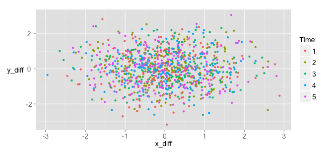
The time no longer tells us about the value of the data. As a consequence, the data no longer appear correlated. This reveals that the data is actually unrelated. It’s not as fun, but it’s the truth.
A criticism of this approach that seems legitimate (but isn’t) is that since we’re screwing with the data first to make it look random, of course the result won’t be correlated. However, if you take successive differences between the original non-time-series data, you get a correlation coefficient of , same as we had above! Differencing destroyed the apparent correlation in the time series data, but not in the data that was actually correlated.
Samples and populations
The remaining question is why the correlation coefficient requires the data to be i.i.d. The answer lies in how is calculated. The mathy answer is a little complicated (see here for a good explanation). In the interests of keeping this post simple and graphical, I’ll show some more plots instead of delving into the math.
The context in which is used is that of fitting a linear model to “explain” or predict as a function of . This is just the from middle school math class. The more highly correlated is with (the vs scatter looks more like a line and less like a cloud), the more information the value of gives us about the value of . To get this measure of “cloudiness”, we can first fit a line:
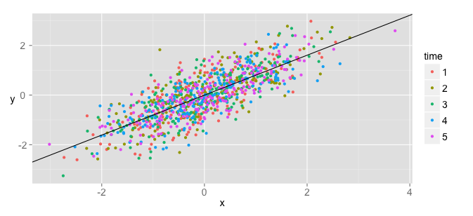
The line represents the value we would predict for given a certain value of . We can then measure how far each value is from the predicted value. If we plot those differences, called , we get:
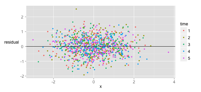
The wider the cloud the more uncertainty we still have about . In more technical words, it’s the amount of variance that’s still ‘unexplained’, despite knowing a given value. The compliment of this, the proportion of variance ‘explained’ in by , is the value. If knowing tells us nothing about , then = 0. If knowing tells us exactly, then there is nothing left ‘unexplained’ about the values of , and = 1.
is calculated using your sample data. The assumption and hope is that as you get more data, will get closer and closer to the “true” value, called Pearson’s product-moment correlation coefficient . If you take chunks of data from different time points like we did above, your should be similar in each case, since you’re just taking smaller samples. In fact, if the data is i.i.d., itself can be treated as a variable that’s randomly distributed around a “true” value. If you take chunks of our correlated non-time-series data and calculate their sample correlation coefficients, you get the following:
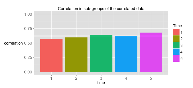
where the line represents the sample correlation coefficient for the entire sample. The important thing is that gives you a reasonable idea of what the population is, and becomes a better estimator the more data you get. If you do the same thing for our time series data, you get something very different:
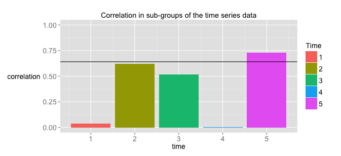
As you can see, the sample correlation coefficient varies a LOT depending on what data subset you’re using. Why, then, should we assume that the particular sample value we’ve estimated for our time series is a good estimation of the “true” population correlation coefficient ? That’s right, we shouldn’t.
The main takeaway here is that the correlation coefficient is NOT an estimator of the population correlation coefficient when the time series are autocorrelated. You can find correlations between time series, but first you have to use some method to “de-trend” the data and take out any autocorrelation. If you do that, the sample value can then be interpreted as an estimator of the true population value.
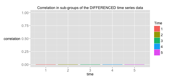
Since the true value for unrelated variables like the ones in our time series is 0, looking at subpopulations of the differenced, de-trended data should give us correlations of 0. Critically, each sub-group of the data should have a correlation coefficient that’s near the value of the correlation coefficient of the entire sample.
I hope this helps clear up the confusion a little.
